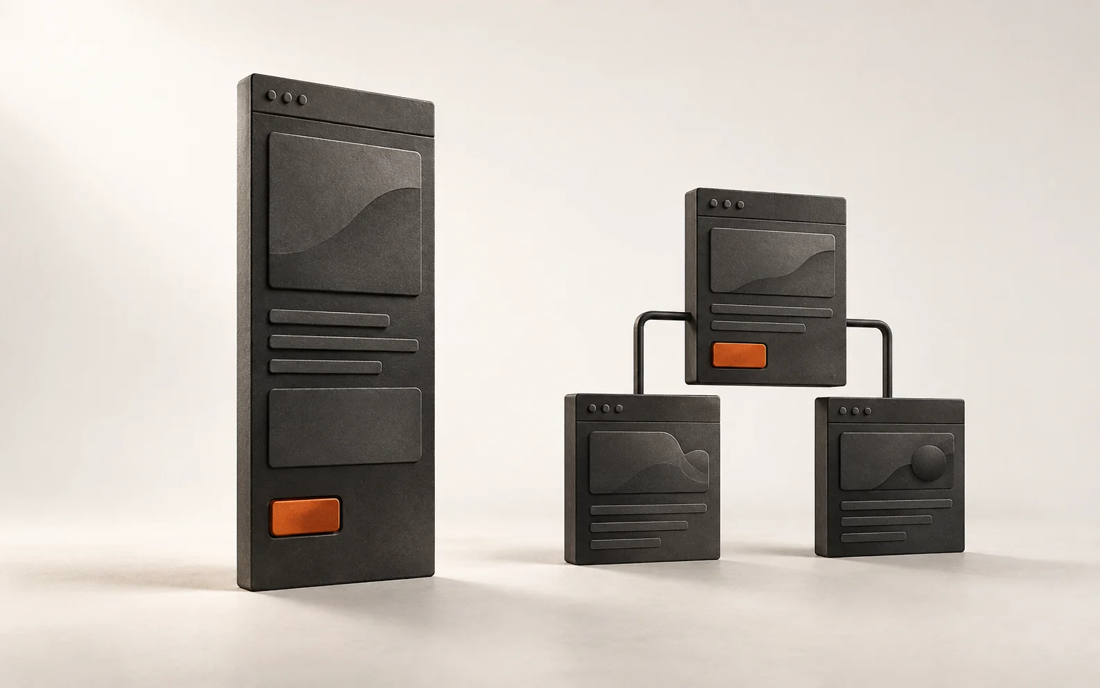
“Should I get a landing page or a website?” is one of the first questions people ask when they decide to invest in their digital presence, and it often comes with another: "which one is cheaper?" The question that actually helps you decide is different: what does this page need to do for your business in the next six months? This guide compares the two formats by the job each one does, shows when each makes sense and ends with five questions to help you decide based on where you are now.
The difference in practical terms
A landing page is a page built to receive a specific visitor, who arrives from an ad, a link or a campaign, and lead them to a single action: request a quote, book an appointment, message on WhatsApp. Everything on it exists for that action.
A company website is a set of pages that answers different questions from different people: what you do, for whom, how you work, who's on the team, where you are, how to hire you. It supports search, trust and the presentation of multiple services at the same time.
| Landing page | Company website | |
|---|---|---|
| Main job | Convert a visitor who already arrived with intent | Be found, explain and build trust |
| Where the visitor comes from | Ad, campaign, link sent | Search, Business Profile, referral, social media, AI |
| Possible actions | A | Several, with one main action per page |
| How it's measured | Page conversion rate | Contacts by origin and service page |
| Lifespan | Lasts as long as the campaign or offer | Ongoing, with updates |
Neither is the "simple" version of the other. They are tools for different jobs, and a common mistake is using one to do the other's job.
When a landing page makes sense
You will advertise a specific offer. This is the classic case. Google Ads guidance is to choose a landing page that closely matches your ad and keywords, because that consistency improves two components of Quality Score: ad relevance and landing page experience. Google also asks that the page echo the ad's call to action, keep important information at the top, be easy to use on mobile and avoid excessive ads and pop-ups1. If the ad talks about "air conditioning installation in 24 hours", the page needs to talk about that, not open on a home page listing ten other services.
You have a campaign with a beginning and an end. The opening of a new location, an event, a special limited-time offer. A dedicated page that comes down when the campaign ends makes sense.
You want to test an offer before investing more. A landing page allows you to measure whether there is real interest in a new service before reorganizing the entire site.
What makes a landing page work is focus. Nielsen Norman Group, known for its usability research, notes that people tend to leave a page within 10 to 20 seconds and that, to hold their attention longer, the value proposition needs to be clear within 10 seconds2. The same logic applies to forms: cutting unnecessary fields reduces the effort for whoever fills them out and increases the completion rate. The recommendation is to eliminate anything that can be obtained another way, asked later or simply left out3.
In practice
For each ad you intend to run, write its promise on one line. If there is no page whose title repeats this promise, that page needs to be created before the ad.
When a company website makes sense
You sell more than one service or serve different audiences. A firm that handles business registration and tax planning, a clinic with three specialties, a studio that serves both individuals and companies. Each service has its own questions, its own objections and, often, a different customer. Google's SEO guide recommends thinking about the words readers would use to search for each piece of content and notes that Google finds pages mainly by following links from other pages4. One page per service makes both easier and gives you the right address to send people coming from the Business Profile, an ad or a referral.
Your client researches before deciding. When the service involves trust, as in health, law, accounting, renovations and construction, people tend to compare before deciding. Nielsen Norman Group points to four factors that build credibility on a website: design quality, transparency about everything that affects the customer experience, complete, correct and current information, and connection to the rest of the web, such as a presence on review sites, social networks and media outlets5. On a single page, it is difficult to cover all four.
The first impression is also visual. A 2006 study published in the journal Behaviour & Information Technology tested how long it takes people to form an opinion about the visual appeal of a page. The answer is in the article title: 50 milliseconds6. Design does not replace content, but it influences the decision to continue reading.
You want to be found by search engines and AI assistants. In a test by BrightLocal with 20 local searches in ChatGPT, Gemini, Perplexity and Google's AI Mode, the companies' own websites were the majority of sources consulted7. Google, in turn, values content based on first-hand experience that goes beyond what anyone could write8. A website with well-written service pages is the material these tools read. The article about customers who search ChatGPT before calling goes deeper into this point.
The website is also where people go to double-check. In BrightLocal's survey of American consumers, 54% said they visited the company's website after reading positive reviews9. People coming from the Business Profile want to confirm what they read.
In practice
List the questions a new customer asks before buying. If they fit on a single page, a landing page may be enough. If each service raises different questions, you need a website.
Five questions to help you decide
- Will you be advertising in the next three months? If so, each advertised offer needs a page that matches the ad.
- How many services do you want to sell now? A single, well-defined main service fits on a landing page. Several call for a website.
- Does your customer compare before buying? In general, the higher the perceived value and risk, the more people research, and the more the website matters.
- Where do customers come from today? If most come from search, the Business Profile or referrals who look up your name, the website is the foundation. If almost all come from campaigns, the landing page does more of the work.
- Who will keep this updated? An outdated website loses the “complete, correct and current” factor5. Plan maintenance along with the project.
| If your situation is... | The format that usually makes the most sense |
|---|---|
| One service, paid campaign, set timeframe | Landing page |
| Various services, customers searching and comparing | Company website |
| New business, still testing the offer | Landing page now, website once the offer is proven |
| You already have a website and will advertise | Landing pages per campaign, linked to the website |
A middle ground
For many service businesses, the most useful answer is to combine the two formats: a company website where each service page works as a landing page, with a clear title, proof and a main action, and temporary campaign pages on the same domain when you run ads. This way, the site gains strength over time and campaigns don't start from scratch.
Common mistakes
- Landing page trying to be a website. Full menu, five services and three different buttons. It loses the focus that justifies its existence1.
- Ad leading to home page. The person clicked on a specific promise and landed on a generic storefront1.
- Page without address, team or clear form of contact. Lack of transparency undermines credibility5.
- Long form on first contact. Ask only what's needed for the first follow-up3.
- Deciding on price alone. The cheapest format that doesn't do the job right costs you in lost customers.
Checklist
- I know what work the page needs to do in the next six months.
- Each planned ad has a page with the same promise.
- The value proposition is clear within the first few seconds on mobile.
- Each page has a main action.
- The form only asks for what is necessary.
- Address, team and contact details are visible.
- Each important service has its own page if there is more than one.
- There is someone responsible for keeping the content updated.
Before you decide
Choosing the format becomes easier when you know where your digital presence is losing customers today: in search, on the first screen, on the way to contact or in trust. The free diagnosis from Flowt measures this with fixed criteria and shows, point by point, where the gap is. With this map in hand, the question "landing page or website" usually answers itself.