Financial close softwareNew York
Tallyfold.
Website for software that organizes the monthly financial close for controllers at companies with 200 to 2,000 employees. With no client logos or results percentages, the proof had to come from the product itself, shown working right on the first screen.
Case study
The challenge.
Financial software websites tend to prove value with client logos, integrations with well-known systems and percentage gains. A new brand has none of that to show, and making it up would be misleading. The buyer is a controller, who spots in seconds a date or a balance that doesn't add up. The site needed to show the product with professional rigor, explain what changes in the close and publish the price, which in this industry usually sits behind a “talk to sales”.
- 01 Proof without logosClient logos and percentage gains are the industry's standard proof, and a new brand has neither.
- 02 A reader who checksControllers notice impossible dates and numbers that don't reconcile; one error in the dashboard would sink the credibility of everything else.
- 03 Closing in spreadsheetsThe real problem is a checklist kept by one person, reconciliations done the day before and approvals lost in email.
- 04 Hidden pricingIn this industry, plans usually end in “talk to sales”; publishing prices required a clear table consistent with the home page.
Flowt Method
The diagnosis.
The site proves the product by showing the month-end close at work, with no client logos or results percentages, and takes the controller from the first screen to a booked demo.
- SpeedAn interface built entirely in HTML and SVG, with no photos; native scrolling, no smooth-scroll library, and GSAP only in the dashboard and modules.
- Verifiable accessibilityLighthouse 100 and axe with no violations.
- Path to the main action1 tap to the demo page, 11 to a booked time slot; on mobile the first field sits at 1,035 px, below the fold.
- Pricing pageA dedicated page with three plans and prices ($1,250 and $2,900 per month), per-entity billing, unlimited users, a comparison table and billing questions; the only thing missing is how to cancel.
- Product and path to valueThe dashboard shows the product before any form, the scheduler offers time slots right away and implementation comes as a specification (4 to 6 weeks).
See the full analysis
All 13 criteria, with the evidence for each point: what meets the criterion, what partly meets it and what depends on a real company. Because the brand is a concept, there is no "before" and no total score.
Being found
Title and description on each page, one H1, SoftwareApplication JSON-LD with the plans and FAQPage, and the dashboard in text, not as an image. Partial because of the deliberate noindex and the lack of third-party mentions.
Concept brand, no real reviews. In a real project, volume, recency and responses are measured before and after on G2 and Capterra.
Being chosen
It says what it does (monthly close software) and shows “Book a demo” and the product. It doesn't say who it's for or what sets it apart from competitors: per-entity pricing only appears in Pricing.
4 of 6 checks
The proof is the product: a dashboard with data marked as simulated and a trail for every approval. There is no team, no clients and no about page; a real company would add founders, clients and reviews with a stated source.
There are no external channels to compare. Within the site, SSO, SCIM, data residency and auditor access are described the same way on the home page and in the pricing table.
A dedicated page with three plans and prices ($1,250 and $2,900 per month), per-entity billing, unlimited users, a comparison table and billing questions; the only thing missing is how to cancel.
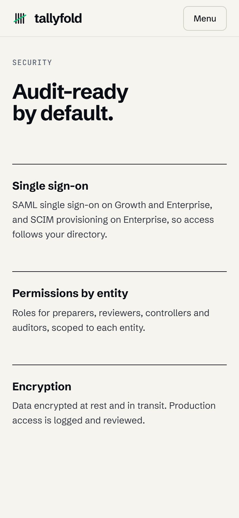
A section with SSO and SCIM by plan, per-entity permissions, encryption and data residency; SOC 2 Type II appears as an example, under NDA, without saying “certified”. A security page, a DPA and a subprocessor list are missing.
It explains the fit: it reads from the ERP, the banks and the subledgers, writes only what is approved and does not replace the ERP. It names no system, on purpose; a real project would include the list.
Being contacted
An interface built entirely in HTML and SVG, with no photos; native scrolling, no smooth-scroll library, and GSAP only in the dashboard and modules.
Lighthouse 100 on mobile · LCP 1.4 s
Lighthouse 100 and axe with no violations. The module index is real navigation, with aria-current, the annual or monthly toggle works with the arrow keys and, with reduced motion, the dashboard opens in its final state.
axe: 0 violations
No trackers; the demo form states that nothing is sent. No analytics installed and no privacy policy, which a real SaaS would need to ask for a work email and company.
1 tap to the demo page, 11 to a booked time slot; on mobile the first field sits at 1,035 px, below the fold. The page says what the demo covers and who takes part.
1 tap to the page · 11 to book
The dashboard shows the product before any form, the scheduler offers time slots right away and implementation comes as a specification (4 to 6 weeks). The form has 6 fields, one more than ideal.
Industry obligationsThere is no mandatory registration in this industry; the site follows the two rules that matter: SOC 2 appears as a sample report, without “certified”, and there are no testimonials or client numbers (FTC rule).
In a real project, each criterion is measured before and after, with the same yardstick and evidence for each point. There is no score: what you see is how many points remain open.
Strategy
Strategy and site map.
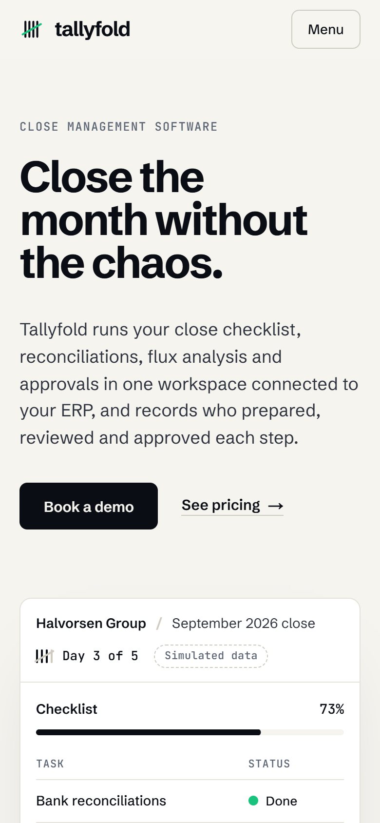
The first screen shows the product at work: a close dashboard with simulated data, labeled as such. Just below, the problem appears in the controller's language, and the product is split into four modules, in the order the close happens, each with an interface vignette. Integration and security answer IT's questions without naming any real ERP. Pricing is per entity, with unlimited users, and every claim on the home page was checked against the plan table.
01Home
- Opening with live dashboard
- The close today
- Four modules
- Audit trail
- Integration
- Security
- Questions
- Closing
02Pricing
- Opening with annual or monthly billing
- Three plans
- Plan comparison
- Pricing questions
- Closing
03Book a demo
- What the demo covers
- Who takes part
- Contact details
- Time slot selection
- Confirmation
Visual system
Typography, color and rhythm.
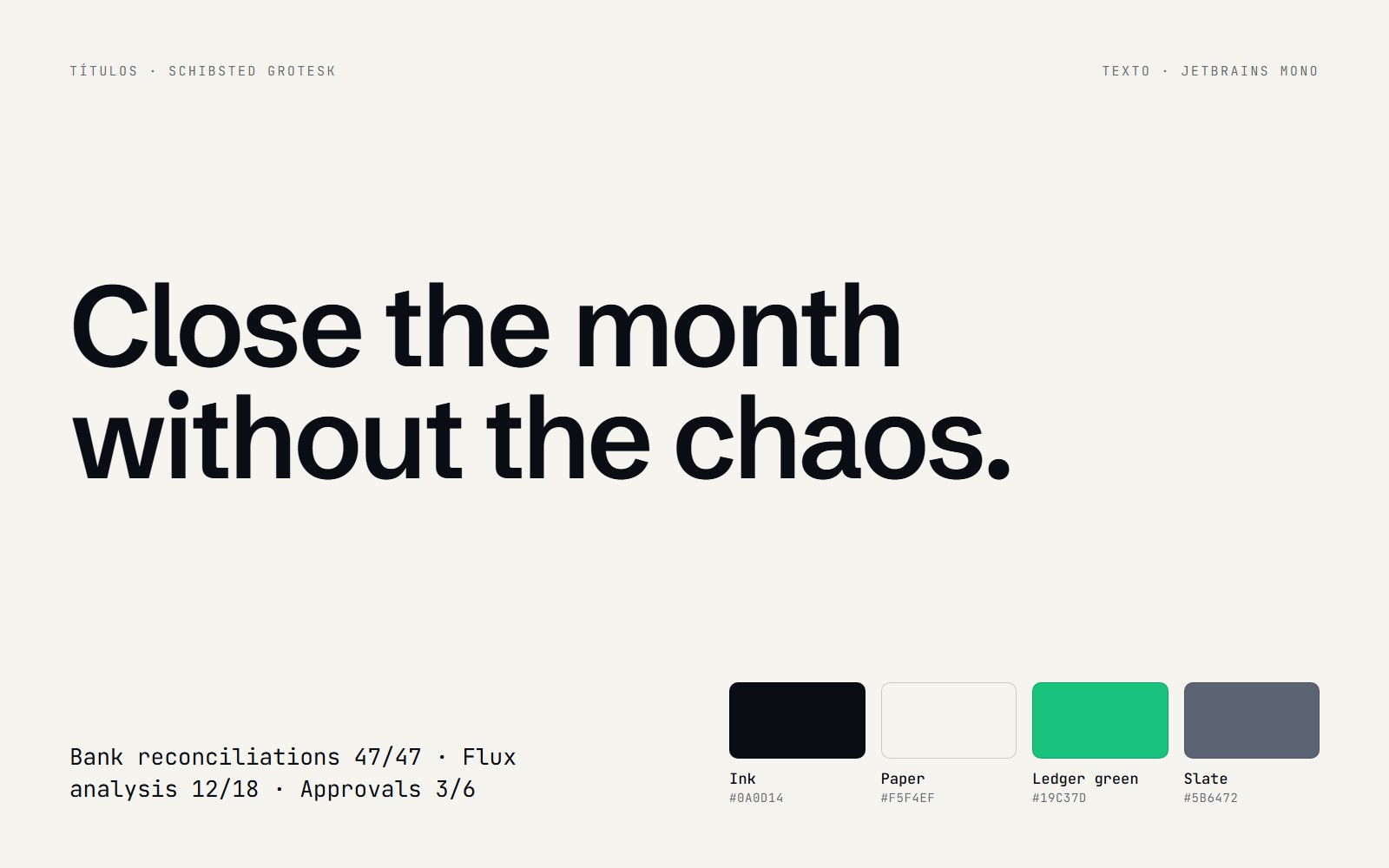
A single family, Schibsted Grotesk, for headings and text, to sound like a work tool; numbers, dates and times are set in a monospaced font and right-aligned, as in a financial spreadsheet. The base is paper and ink. Ledger green appears only in shapes, such as the completed-task dot, and a darker green handles text. The tally marks of the symbol count the days of the close in the dashboard.
- Close dashboard
- Day counter in tally marks
- Module vignettes
- Audit timeline
- Plan comparison table
Signature moment
Live close dashboard.
While the visitor reads the heading, the dashboard completes September's close for a sample company: tasks move from open to review to done, reconciliations match, the revenue variance above the threshold gets an explanation and the log shows who approved and at what time. The controller sees the product working in the vocabulary of their own job. The “simulated data” label stays visible at all times.
On mobile
Made for the small screen.
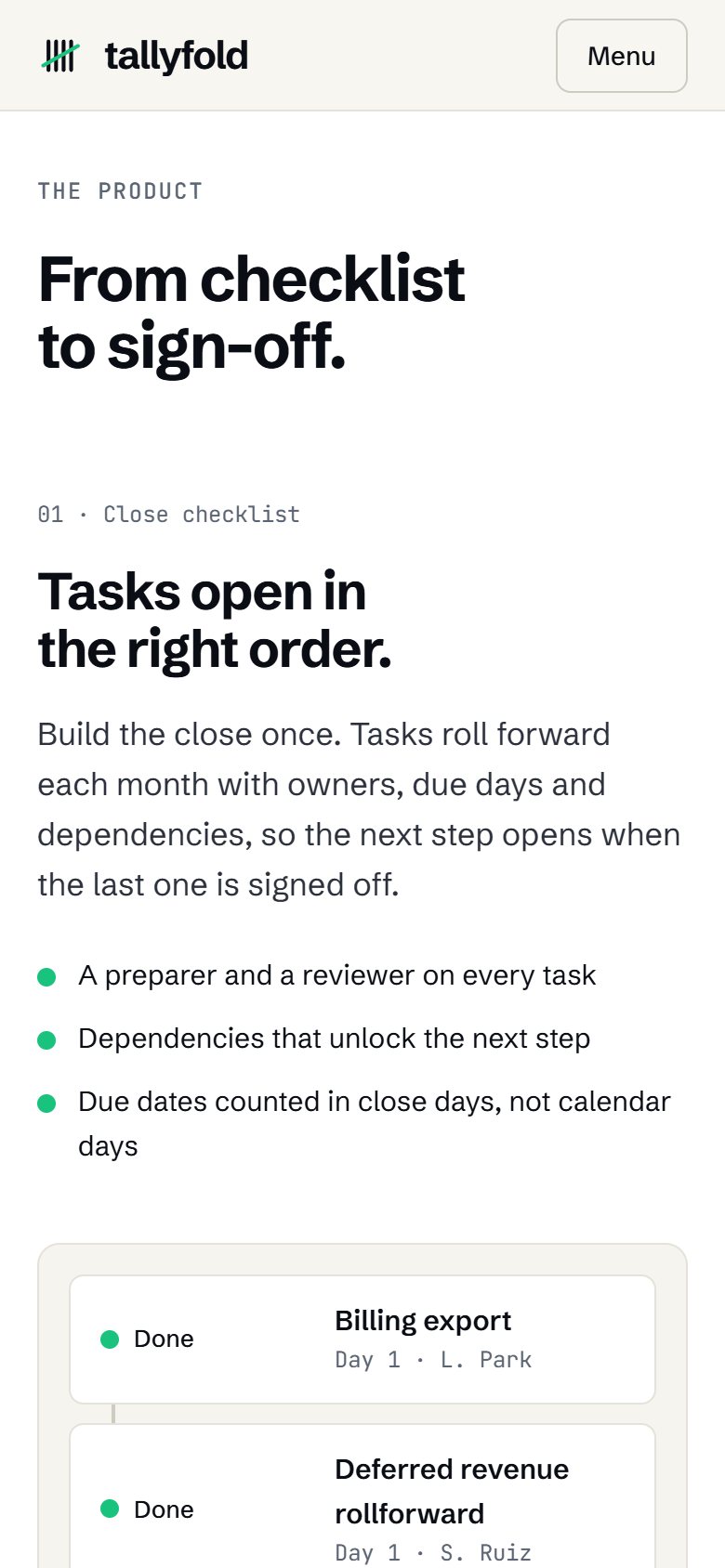
Three screens of the site on a 390 px wide phone, the most common width today.
Receipts
Measured performance.
The scores below were measured on the published site using Google Lighthouse. They are not a promise: they record the state of the site on the measurement date. Demonstrations are presented on video. Measurements record the state of the project on the indicated date.
On mobile
- Largest visible element (LCP)
- 1.4 s
- Stability (CLS)
- 0
- Blocking (TBT)
- 0 ms
On desktop
- Largest visible element (LCP)
- 0.5 s
- Stability (CLS)
- 0
- Blocking (TBT)
- 0 ms
Measured on Oct 3, 2026 with Lighthouse 13.5.0, simulated mobile and desktop. *SEO stays below 100 on purpose: the concept site carries the noindex directive, so it does not appear on Google or compete with real businesses. Accessibility was also checked with axe (zero violations), and alignment was reviewed at 7 screen widths.
Behind the scenes
Fact sheet.
- Pages
- Home, Pricing, Book a demo and 404 page
- Languages
- English (US)
- Technology
- HTML, CSS and JavaScript, no framework, generated by a custom Python script
- GSAP and ScrollTrigger for the dashboard and modules
- Native scrolling, no smoothing library
- Fonts served by the site itself
- Per-page CSS and JS minified with esbuild
- Structured data for the software, plans and FAQs
- Images
- No photographs: the product interface, the integration diagram and the icons were drawn in HTML, CSS and SVG.
- Accessibility
- Keyboard navigation with visible focus, module index as real navigation, dashboard in its final state with reduced motion and zero axe violations.
- Industry rules
- Follows the FTC rule on reviews and testimonials: no testimonials, client logos or real ERP names, and the SOC 2 report is marked as an example.
Start now
Let's bring your online presence up to the level of your service.
Start with the free diagnosis: we measure your online presence and show you, point by point, what to fix first.
Booking open for new projects
Tell us about your project
A few details are enough. We'll ask about the rest.