Corporate lawSão Paulo
Aldren Advocacia.
Website for a corporate law firm in Itaim Bibi. People looking for a lawyer for their company know the problem they have, but not always the name of the practice area that handles it. The site starts with the problem.
Case study
The challenge.
Corporate law firm websites tend to be organized like the firm itself: a list of practice areas with technical names, a partners page and a form. For an executive who has just received an infraction notice or wants to sell the company, this means translating the problem into legal vocabulary before the first contact. At the same time, Provision 205/2021 of the OAB (Brazilian Bar Association) limits what the site can say: no promised results, specific cases, prices or persuasive phrasing. The site needed to guide without offering.
- 01 Problem before practice areaVisitors arrive with a concrete situation, and the site needed to accept that starting point without requiring legal vocabulary.
- 02 Inform without solicitingProvision 205/2021 requires an informative tone, discretion and sobriety, with no promises, prices, rankings or self-aggrandizement.
- 03 A reader with no timeShareholders, boards and executive teams need to understand in minutes who leads the matter and what to prepare for the meeting.
- 04 Discretion with identityThe rule calls for discretion; the challenge was to be discreet without looking like any other firm's website.
Flowt Method
The diagnosis.
The site organizes the firm around the visitor's problem rather than the technical names of practice areas, and puts the company director in touch with the firm in two taps.
- SpeedThe opening is text only, with fonts served by the site itself, and the largest element on screen is the opening paragraph.
- Verifiable accessibilityThe map tabs follow the WAI-ARIA pattern, with arrows, Home and End, and focus is visible.
- Path to the main actionMain action: writing to the firm.
- Service and first stepEach area covers what it does, when it usually comes in, the rules and the partner in charge.
- Content that informsThe situation map organizes the content by the client's problem, with rule and article, steps and documents to gather.
See the full analysis
All 13 criteria, with the evidence for each point: what meets the criterion, what partly meets it and what depends on a real company. Because the brand is a concept, there is no "before" and no total score.
Being found
Title, description and one H1 per page, LegalService data with team, hours and languages, all in text. It stays partial by choice: noindex, AI crawlers blocked and no third-party mentions.
Concept brand, no real reviews. In a real project, volume, recency and responses would be measured before and after on the Google Business Profile.
A Google Business Profile requires a real company and a verified address. In a real project, category, hours, phone, photos and services would be checked before and after.
Being chosen
The first mobile screen shows the practice area, neighborhood, audience and next step. The heading is a motto that would fit another firm; the situation map, the differentiator, only appears on the button.
5 of 6 checks
The structure is ready: four lawyers with practice area, languages and OAB registration marked as an example, a sample opinion with no real case, and the neighborhood. A real firm would add the actual registrations; the rules prohibit cases and clients.
Concept brand, no external channels to compare. Within the site, hours and languages are the same in the footer of the three pages, in the Contact page details and in the structured data.
Concept brand, no Instagram profile. In a real project, we measure whether the profile appears in searches by service and city, with an informative bio and no persuasive phrasing, as Provision 205 requires.
Each practice area lists what it does, when it usually comes into play, the applicable rules and the partner in charge. The first step is described: a message, a conflict check, a reply within two business days and a meeting in person or by video.
The situation map organizes the content by the client's problem, with rule and article, steps and documents to gather. The six technical notes, however, are only sample titles, with no text.
Being contacted
The opening is text only, with fonts served by the site itself, and the largest element on screen is the opening paragraph. Lab measurement, with no field data, because the site has no traffic.
Lighthouse 99 on mobile · LCP 2.1 s
The map tabs follow the WAI-ARIA pattern, with arrows, Home and End, and focus is visible. Without JavaScript, the five panels appear in sequence; with reduced motion, switching is instant.
Lighthouse 100 · axe with no violations across the 4 pages
No trackers, cookies or third-party requests, and the Contact page has a privacy notice with purpose, legal basis, 12-month retention and data protection officer. No analytics installed, because it is a concept.
Main action: writing to the firm. The Contact page explains what comes next: a conflict check, a reply within two business days with the partner's name, and the first meeting.
2 taps (Menu and Contact); 3 through the map, with the topic filled in
Industry obligationsProvision 205/2021 and the OAB Code of Ethics: the firm's name and the registration of the four lawyers in the footer, marked as examples, with no prices, promises, specific cases, rankings or OAB symbol.
In a real project, each criterion is measured before and after, with the same yardstick and evidence for each point. There is no score: what you see is how many points remain open.
Strategy
Strategy and site map.
The home page opens with a situation map: five sentences an executive would say, such as “I received a tax assessment” or “a partner wants to leave”. For each one, the site shows which practice areas lead and which support, a regulatory rule with its article, the usual steps and the documents to gather, and it closes with a neutral contact, with the topic already filled in. Those who already know what they are looking for come in through the practice areas, in the home page accordion or on the Practice page. The two entry points intersect: each area points to the situations where it usually comes into play.
01Home
- Opening
- Situation map
- Practice areas
- How we work and sample opinion
- Team
- Technical notes
- Contact
02Practice
- Opening with a shortcut to the map
- Index that follows the scroll
- Five areas in detail
- Where to start
03Contact
- Opening
- How the firm responds
- Contact details
- Form
- Privacy notice
Visual system
Typography, color and rhythm.
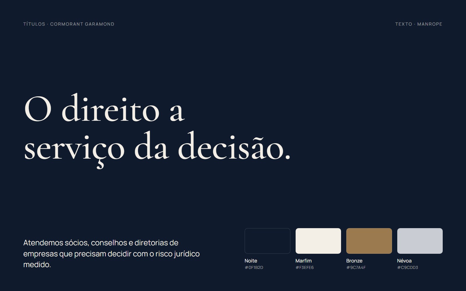
Cormorant Garamond gives the headings the register of a legal document, and Manrope keeps the text short and readable. Midnight blue and ivory form the base; bronze appears only in thin rules and on the seal. A margin column holds the labels “§ 1”, “§ 2”, as in a legal opinion, and motion is limited to opening and closing: tabs, accordion, rules that draw themselves and a seal that enters once.
- Situation map
- Lead-and-support rail
- Sample opinion sheet
- Monogram seal
- Regulatory footer
Signature moment
Situation map.
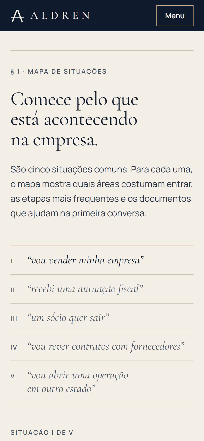
Visitors choose one of the five situations, numbered I to V, and a bronze line connects the choice to the panel. There, a rail shows the role of each area (leads, supports or usually not involved), followed by the regulatory rule with its article, the steps and the documents, with checkboxes. The closing names the partner for the first meeting and leads to the contact form with the situation filled in. Everything works with the keyboard.
On mobile
Made for the small screen.
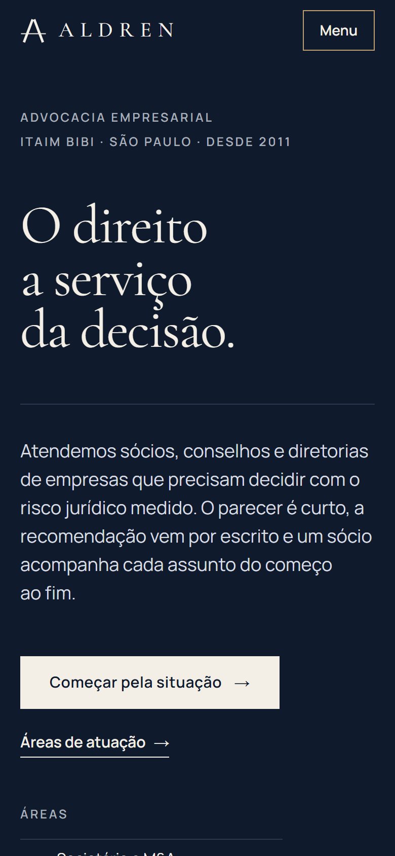
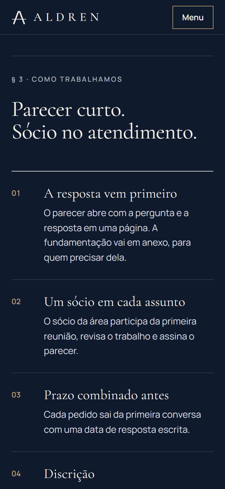
Three screens of the site on a 390 px wide phone, the most common width today.
Receipts
Measured performance.
The scores below were measured on the published site using Google Lighthouse. They are not a promise: they record the state of the site on the measurement date. Demonstrations are presented on video. Measurements record the state of the project on the indicated date.
On mobile
- Largest visible element (LCP)
- 2.1 s
- Stability (CLS)
- 0
- Blocking (TBT)
- 0 ms
On desktop
- Largest visible element (LCP)
- 0.5 s
- Stability (CLS)
- 0
- Blocking (TBT)
- 0 ms
Measured on Oct 3, 2026 with Lighthouse 13.5.0, simulated mobile and desktop. *SEO stays below 100 on purpose: the concept site carries the noindex directive, so it does not appear on Google or compete with real businesses. Accessibility was also checked with axe (zero violations), and alignment was reviewed at 7 screen widths.
Behind the scenes
Fact sheet.
- Pages
- Home, Practice, Contact and 404 page
- Languages
- Portuguese (Brazil)
- Technology
- HTML, CSS and JavaScript, no framework
- GSAP and ScrollTrigger for the opening and closing motion, with native scrolling
- Custom Python generator: map, areas and team come from a single data file
- Images in AVIF and WebP, in multiple widths
- CSS and JavaScript minified with esbuild
- Fonts served by the site itself, with metric-adjusted fallback faces
- schema.org structured data (LegalService)
- Images
- Seven AI-generated photographs (OpenAI and Higgsfield), in a close-framed series of material and light, processed with the same treatment; seal, monogram, map rail and opinion sheet drawn in SVG and HTML in code.
- Accessibility
- Map tabs following the WAI-ARIA pattern (arrows, Home and End), visible focus, the five panels in sequence without JavaScript, instant switching with reduced motion and zero axe violations across the four pages, on desktop and mobile.
- Industry rules
- Follows Provision 205/2021 and the OAB Code of Ethics: informative content, “practice areas” instead of “specialists”, no promises, prices or rankings, and each lawyer's registration number, marked as an example, in the footer.
Start now
Let's bring your online presence up to the level of your service.
Start with the free diagnosis: we measure your online presence and show you, point by point, what to fix first.
Booking open for new projects
Tell us about your project
A few details are enough. We'll ask about the rest.