Dental clinicCuritiba
alvéa Odontologia.
Website for a dental clinic in Batel, Curitiba, made for adults who put off the dentist out of fear or bad experiences. The clinic offers long appointments and delivers the plan in writing; the site needed to convey that calm before the first visit.
Case study
The challenge.
Dental websites often speak the language of procedures: treatment lists, office photos and promises of a smile. For someone who has put off seeing a dentist for years, that vocabulary can be off-putting. Sector rules also constrain common approaches: the concept avoids before-and-after images and promises of results. The publication of dental images depends on CFO rules, who publishes them and the applicable authorizations; publicity cannot become a consultation. Four of the five award-winning references we analyzed promised results. The site needed to explain without making promises or asking for health data.
- 01 The question comes firstPeople who put off the dentist can describe what they feel; the name of the treatment comes later, at the assessment.
- 02 Explain without diagnosingThe Code of Ethics prohibits consultation or diagnosis through mass media; promotion must clarify and educate.
- 03 Health data is sensitiveUnder the LGPD (Brazil's data protection law), what a person feels is sensitive data; the best path was not to collect any of it.
- 04 A clinic without the treatment roomResolution CFO-196/2019 restricts images of equipment, instruments and procedures; the clinic needed to appear in another way.
Flowt Method
The diagnosis.
The site speaks to people who keep putting off the dentist, explains the long consultation and the written plan before the first visit, and leads to booking in one tap.
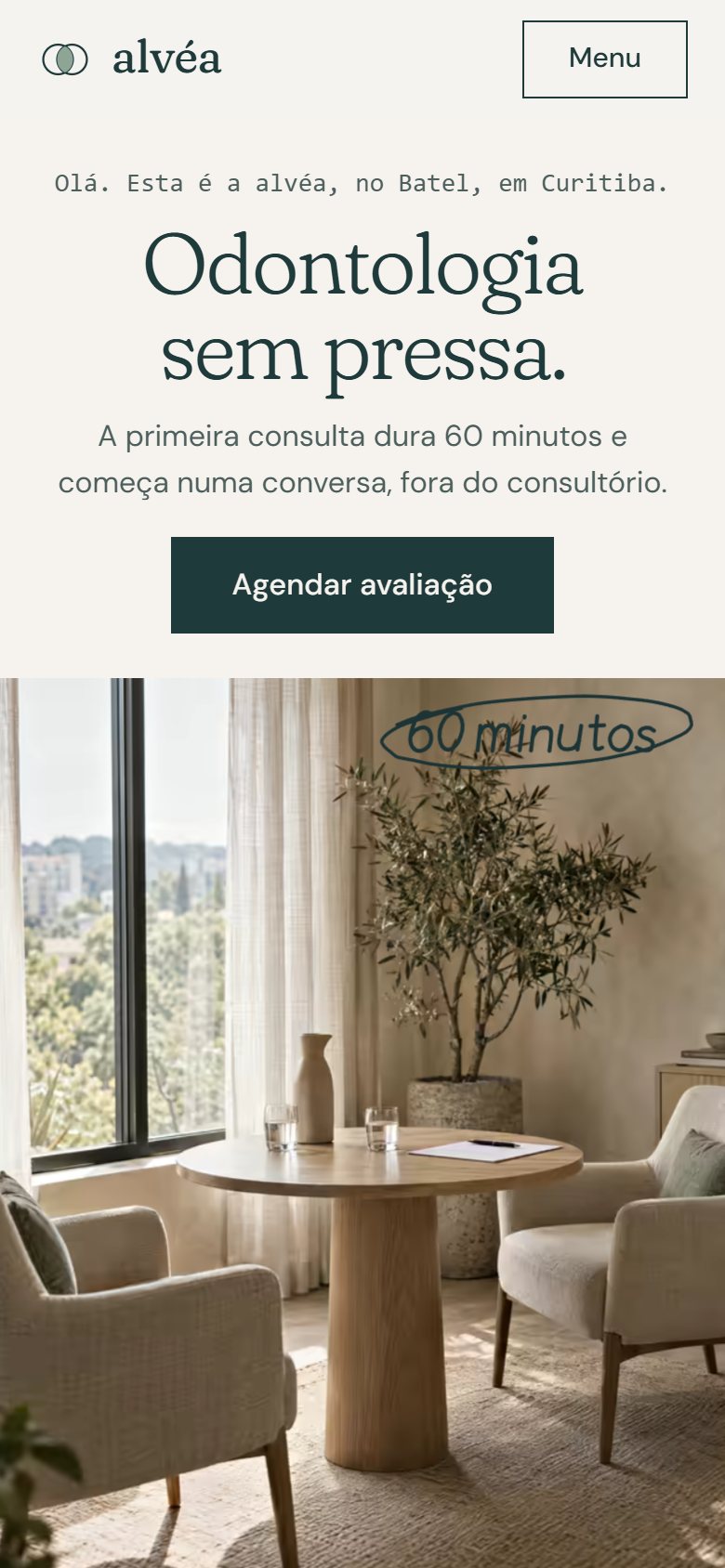
- First screen and value propositionOn mobile, the first screen says what it is, where it is and what is different: a 60-minute assessment that starts with a conversation and a written plan before any procedure.
- Verifiable accessibilityThe guide opens by click, tap or keyboard, with its state announced and one heading per panel.
- Path to the main actionMain action: booking the assessment.
- Service and first stepEach treatment lists steps, typical timeframes and who provides it, with CRO number.
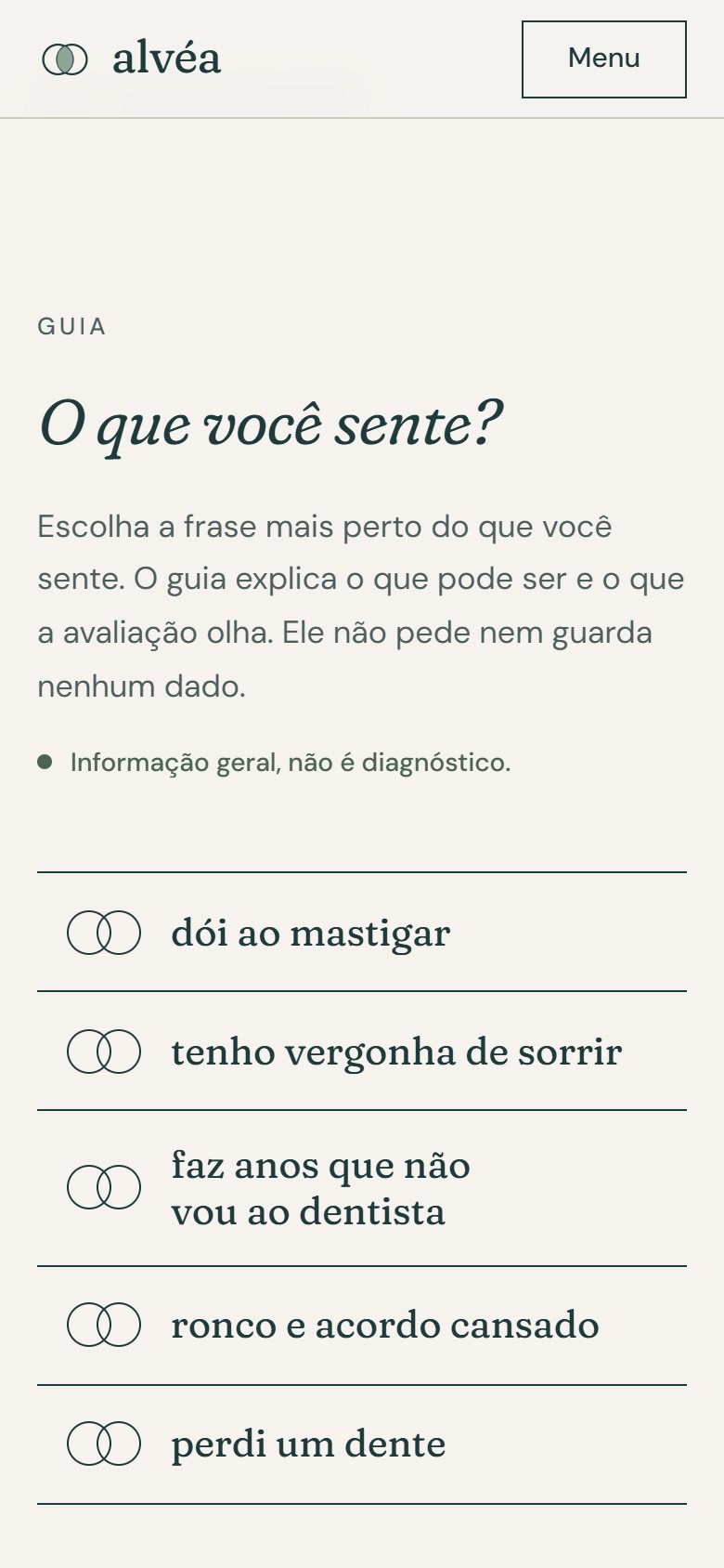
- Content that informsThe guide organizes the content by what the patient feels, says what the assessment looks at and states that it is not a diagnosis.
See the full analysis
All 13 criteria, with the evidence for each point: what meets the criterion, what partly meets it and what depends on a real company. Because the brand is a concept, there is no "before" and no total score.
Being found
Title, description and one H1 per page, Dentist and FAQPage data plus five MedicalProcedure entries, all in text. Opening hours are missing, both in the text and in the data; there is noindex and AI crawlers are blocked.
Concept brand, no real reviews. In a real project, volume, recency and responses would be measured before and after on the Google Business Profile and Doctoralia.
A Google Business Profile requires a real company and a verified address. In a real project, category, hours, phone, photos and services would be checked before and after.
Being chosen
On mobile, the first screen says what it is, where it is and what is different: a 60-minute assessment that starts with a conversation and a written plan before any procedure. The Book button stays in view.
6 of 6 checks
Structure in place: two dentists with specialties and CRO registrations, plus the clinic registration and technical lead, all marked as examples. The concept uses neither testimonials nor before-and-after images; a real clinic would use verified registrations and follow the applicable publication rules.
Concept brand, no external channels to compare. Within the site, phone, neighborhood and CRO registrations are the same in the footer of the four pages and in the team blocks.
Concept brand, no Instagram profile. In a real project, we measure whether the profile appears in searches by dentist and neighborhood, with a bio, a booking link and content within CFO rules.
Each treatment lists steps, typical timeframes and who provides it, with CRO number. The assessment is split into four parts, with what to bring; the plan arrives within 5 business days, and reimbursement is explained.
The guide organizes the content by what the patient feels, says what the assessment looks at and states that it is not a diagnosis. The common questions cover price, insurance, fear and urgency.
Being contacted
LCP exceeds the 2.5 s limit that Google considers good: the largest element is the opening paragraph, which enters with an animation. Lab measurement, with no field data.
Lighthouse 96 on mobile · LCP 2.7 s
The guide opens by click, tap or keyboard, with its state announced and one heading per panel. Without JavaScript, the five panels appear open, and both colors of the text that lights up pass AA.
Lighthouse 100 · axe with no violations across the 4 pages and the guide states
No trackers, cookies or third-party requests; booking asks for no health data and the consent covers only name and contact details, with a note on how the data is processed. No analytics installed, because it is a concept.
Main action: booking the assessment. The page says the confirmation arrives by phone or WhatsApp within one business day, with address and fee, and lists what to bring.
1 tap to the scheduler
Industry obligationsBrazilian Dental Code of Ethics and CFO-196/2019: clinic registration and the technical lead's CRO registration in the footer, marked as examples. The concept displays neither prices, before-and-after images, testimonials nor procedure images. Publication must consider who publishes and the applicable authorizations.
In a real project, each criterion is measured before and after, with the same yardstick and evidence for each point. There is no score: what you see is how many points remain open.
Strategy
Strategy and site map.
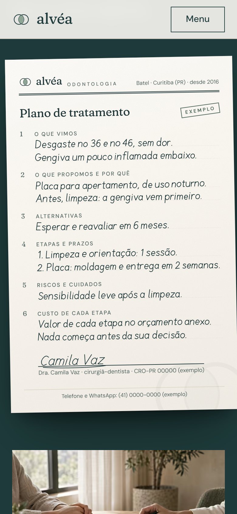
The home page swaps the logic of procedures for the logic of questions. Right after the opening comes the guide “What do you feel?”, with five sentences such as “it hurts when I chew” and “I lost a tooth”. Then come the written plan, the 60-minute assessment in four parts, the clinic, the team with their CRO (dental registration) numbers and common questions. The Treatments page repeats the guide and details each treatment with typical steps and timeframes. Booking asks only for a name and contact details and states that it asks nothing about health.
01Home
- Opening
- Guide: what do you feel?
- Written plan
- The assessment
- The clinic
- Team
- Common questions
- Closing with booking
02Treatments
- Opening
- Guide: what do you feel?
- Treatment list
- Closing with booking
03Book
- Opening
- Day selection
- Time selection
- Name, phone and consent
- Before you come
Visual system
Typography, color and rhythm.
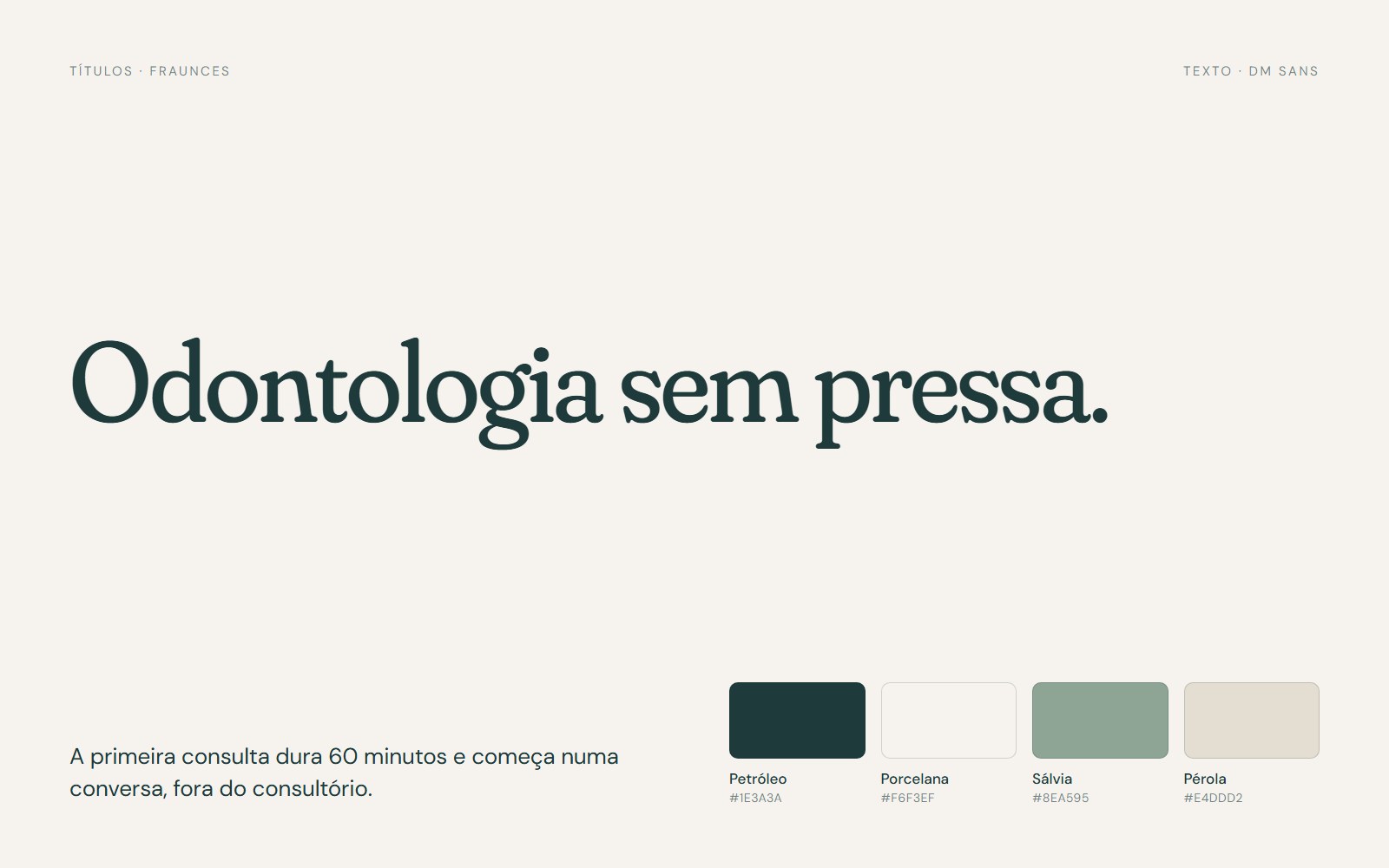
Fraunces for headings, in italics at section openings, and DM Sans for body text. Petrol and porcelain form the base, with sage and pearl in the details: home colors, far from clinical white. The two circles of the symbol become a system: photo frames, the guide row and the lens cutout.
- Guide in circles
- Text that lights up
- Plan document
- 60-minute circle
- House diagram
Signature moment
What do you feel?.
Five overlapping circles, drawn like the symbol, hold sentences such as “I snore and wake up tired”. When you pick one, the panel explains what it might be, what the 60-minute assessment looks at and the possible paths, if the assessment points to them; only at the end does it invite you to book. Nothing is typed, stored or sent, and each panel states that it is general information, not a diagnosis.
On mobile
Made for the small screen.
Three screens of the site on a 390 px wide phone, the most common width today.
Receipts
Measured performance.
The scores below were measured on the published site using Google Lighthouse. They are not a promise: they record the state of the site on the measurement date. Demonstrations are presented on video. Measurements record the state of the project on the indicated date.
On mobile
- Largest visible element (LCP)
- 2.7 s
- Stability (CLS)
- 0
- Blocking (TBT)
- 0 ms
On desktop
- Largest visible element (LCP)
- 0.7 s
- Stability (CLS)
- 0
- Blocking (TBT)
- 0 ms
Measured on Oct 3, 2026 with Lighthouse 13.5.0, simulated mobile and desktop. *SEO stays below 100 on purpose: the concept site carries the noindex directive, so it does not appear on Google or compete with real businesses. Accessibility was also checked with axe (zero violations), and alignment was reviewed at 7 screen widths.
Behind the scenes
Fact sheet.
- Pages
- Home, Treatments, Book and 404 page
- Languages
- Portuguese (Brazil)
- Technology
- HTML, CSS and JavaScript, no framework
- GSAP and ScrollTrigger for the text that lights up and the plan document
- Custom Python generator: the guide and the treatments come from a single data file, used on both pages
- Plan document, 60-minute circle and house diagram in SVG and HTML
- Images in AVIF and WebP, in multiple widths
- CSS and JavaScript minified with esbuild
- Fonts served by the site itself, with metric-adjusted fallback faces
- schema.org structured data (Dentist and FAQPage)
- Images
- Ten AI-generated photographs (Higgsfield and OpenAI), only of spaces, light and hands, with no faces, dental chair or instruments, processed with the same treatment and cropped into the shapes of the symbol.
- Accessibility
- Guide operable by keyboard and touch, complete panels without JavaScript, text that lights up with AA contrast in both states, reduced-motion version and zero axe violations across the four pages, also with the panels open.
- Industry rules
- The concept avoids before-and-after images and promises of results. The publication of dental images depends on CFO rules, who publishes them and the applicable authorizations. Professional registrations are marked as examples.
Start now
Let's bring your online presence up to the level of your service.
Start with the free diagnosis: we measure your online presence and show you, point by point, what to fix first.
Booking open for new projects
Tell us about your project
A few details are enough. We'll ask about the rest.