Boutique hotelLisbon
Miradouro 14.
Website for a 14-room hotel in an 1890 building at the top of Graça, in Lisbon. The house needed to stand out through concrete details, without awards, ratings or hotel adjectives, and take guests from the view to a direct booking.
Case study
The challenge.
Boutique hotel websites tend to repeat the same devices: the neighborhood described as “the heart of the city”, room copy identical to the booking platforms, awards from ranking lists and review scores as proof, and a booking flow that opens in a slow engine at another address. In a 14-room house, this erases exactly what sets it apart. The site needed to show what is specific to the house, answer practical questions before booking and keep the booking button always within reach.
- 01 A neighborhood described from afarGraça is part of the product, and a vague description wastes the strongest selling point of a house at the top of the hill.
- 02 Rooms that look the sameGeneric copy makes three room categories look like one, and the choice comes down to price alone.
- 03 Limitations in the fine printAn 1890 house with no elevator and the tram passing by the door needs to say so before booking.
- 04 Booking off the siteWhen booking means leaving for another site, the decision cools off; booking had to be one tap away from anywhere on the site.
Flowt Method
The diagnosis.
The site presents the 1890 house through details anyone can check, such as room size, views and walking times, and takes the guest from the first screen to a direct booking without leaving the hotel's site.
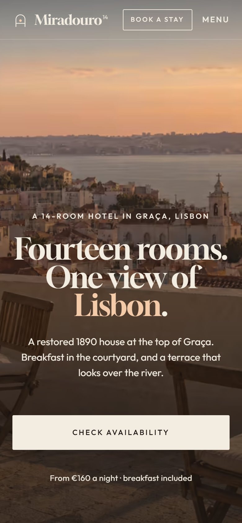
- First screen and value propositionThe first screen says what it is and where (a 14-room hotel in Graça, Lisbon), gives the concrete differentiator (an 1890 house, courtyard, terrace over the river) and already includes the date search.
- SpeedFonts and libraries served by the site itself, AVIF photos 800 px wide for mobile and a 62 KB opening photo.
- Verifiable accessibilityLighthouse 100 and axe with no violations.
- Direct bookingA simulated engine on the site itself, in 4 steps: dates, room and rate, details, review.
- Stay informationEach room with area, bed, view and an “honest line” (tram in the morning, small balcony).
See the full analysis
All 13 criteria, with the evidence for each point: what meets the criterion, what partly meets it and what depends on a real company. Because the brand is a concept, there is no "before" and no total score.
Being found
Its own title and description on each page, one H1, JSON-LD for the Hotel and the 3 rooms, linked EN and PT versions. It stays partial: noindex on purpose, an address with the neighborhood only and no third-party mentions.
SEO 100 without the noindex
Concept brand, no real reviews. In a real project, volume, recency and responses are measured before and after on Booking.com, Google and Tripadvisor.
Concept brand, no Google listing. In a real project, we measure the listing on Google Hotels and Maps, and whether the official site's price appears among the options.
Being chosen
The first screen says what it is and where (a 14-room hotel in Graça, Lisbon), gives the concrete differentiator (an 1890 house, courtyard, terrace over the river) and already includes the date search.
6 of 6 checks
Verifiable facts (m², hours, walking times checked on OpenStreetMap), but no named people or full address, and the AI photos carry no notice on the page. A real hotel would use its own photos.
There are no external channels to compare. Within the site, prices (from €160, €220 and €340), times and cancellation rules are the same on the English and Portuguese pages.
A “from” price per room on the home page and in Rooms, nightly rates in the calendar and a non-refundable rate 10% lower. It still needs to state the advantage of booking direct instead of on a platform.
Each room with area, bed, view and an “honest line” (tram in the morning, small balcony). “Good to know” covers check-in, cancellation, a minimum age of 12, stairs with no elevator and arrival, in EN and PT.
Being contacted
Fonts and libraries served by the site itself, AVIF photos 800 px wide for mobile and a 62 KB opening photo.
Lighthouse 99 on mobile · LCP 1.8 s
Lighthouse 100 and axe with no violations. The “Book a stay” pill leaves the Tab order when it hides, and the 5 moments of the “day at the house” are read by screen readers.
axe: 0 violations
No trackers, and nothing is sent: the booking flow states that the data never leaves the page. No analytics installed and no privacy policy, which a real hotel would need for the booking form.
Dates already filled in on the first screen: 1 tap opens the engine, 8 to confirm. But the summary doesn't say when payment is due or whether a confirmation follows, and there is no phone or email for questions.
1 tap to the engine · 8 to confirm
A simulated engine on the site itself, in 4 steps: dates, room and rate, details, review. The total before confirming and cancellation terms for each rate; the tourist tax stays out of the total, paid at the house.
4 steps · simulated
Industry obligationsThe RNET number and the Livro de Reclamações (Portugal's complaints book) appear in the footer of every page, marked as examples; since the site shows no reviews, the European rule on the origin of reviews does not apply.
In a real project, each criterion is measured before and after, with the same yardstick and evidence for each point. There is no score: what you see is how many points remain open.
Strategy
Strategy and site map.
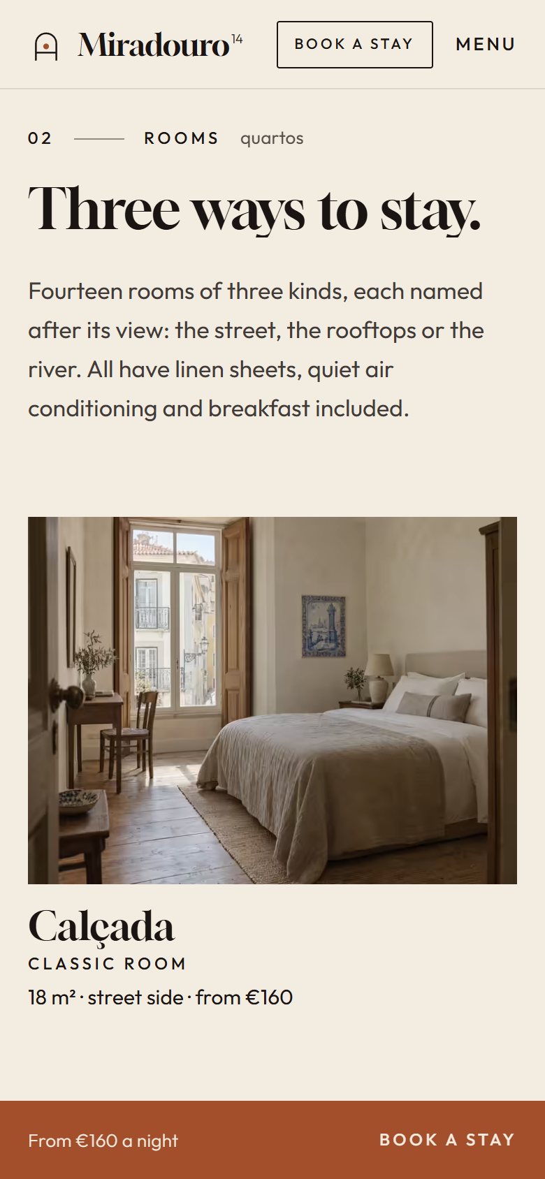
The home page was cut down to seven blocks and follows the order of a visit: the house, the rooms, a day there, the neighborhood on foot, the details and the booking. The rooms are named after their view (Calçada, Varanda, Miradouro), which makes the difference between them immediate. What usually stays hidden became content: a “Good to know” block with stairs, minimum age and parking, and a frank line in each room. Booking appears from the bar in the opening to the closing sentence, and on the booking page the total is always visible.
01Home
- Opening with booking bar
- The house
- Rooms
- A day at the house
- Graça on foot and getting there
- The house details
- Closing with booking as a sentence
02Rooms
- Opening and index
- Calçada
- Varanda
- Miradouro
- Every stay includes
- Good to know
- Closing
03Booking
- Dates
- Room and extras
- Guest details
- Summary
- Note about the site
- Stay summary always visible
Visual system
Typography, color and rhythm.
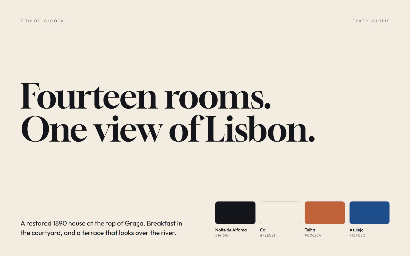
Gloock, a high-contrast serif, appears in the headings and in the large hour and minute numerals; Outfit keeps the body text light. The palette comes from the city: limewash as the base, Alfama night for text and dark sections, terracotta tile for one word per heading and for buttons, darkened to pass contrast, and azulejo for links and the map. The arch is the only curved shape on the site and appears only where there is something to reveal.
- Booking bar in ruled lines
- Room strips
- Hour ruler
- Walking map of Graça
- Booking as a sentence
Signature moment
A day at the house.
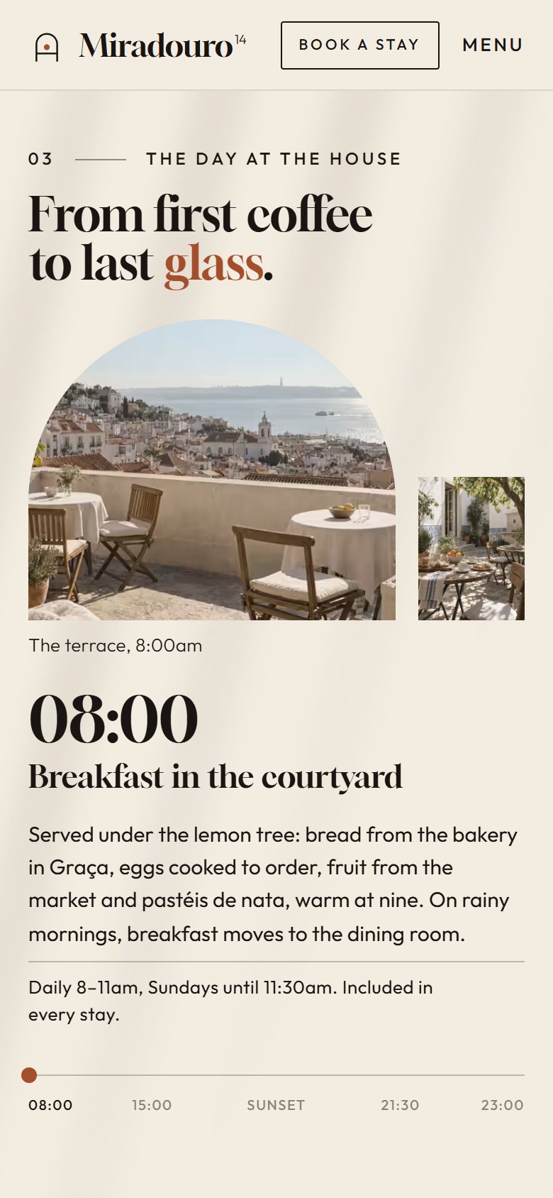
The section stays pinned while the scroll moves through the day, from 8 a.m. to 11 p.m. The background shifts from limewash to terracotta and then to night, the terrace photo changes light inside the arch and a ruler marks the hour. Each moment brings the practical detail: breakfast included, azulejo workshop on Saturdays, fado on Thursdays with 25 seats. Instead of reading a list of services, guests see what the stay would be like.
On mobile
Made for the small screen.
Three screens of the site on a 390 px wide phone, the most common width today.
Receipts
Measured performance.
The scores below were measured on the published site using Google Lighthouse. They are not a promise: they record the state of the site on the measurement date. Demonstrations are presented on video. Measurements record the state of the project on the indicated date.
On mobile
- Largest visible element (LCP)
- 1.8 s
- Stability (CLS)
- 0
- Blocking (TBT)
- 10 ms
On desktop
- Largest visible element (LCP)
- 0.5 s
- Stability (CLS)
- 0
- Blocking (TBT)
- 0 ms
Measured on Oct 3, 2026 with Lighthouse 13.5.0, simulated mobile and desktop. *SEO stays below 100 on purpose: the concept site carries the noindex directive, so it does not appear on Google or compete with real businesses. Accessibility was also checked with axe (zero violations), and alignment was reviewed at 7 screen widths.
Behind the scenes
Fact sheet.
- Pages
- Home, Rooms, Booking and 404 page, in English and Portuguese
- Languages
- English (UK) and Portuguese (Portugal)
- Technology
- HTML, CSS and JavaScript, no framework, generated by a custom Python script
- GSAP (ScrollTrigger, SplitText and DrawSVG) for the animations
- Lenis for smooth scrolling
- View Transitions between pages
- AVIF photos with WebP fallback, in responsive sizes
- Fonts and libraries served by the site itself, JS minified with esbuild
- Structured data for the hotel and rooms, hreflang and sitemap, with noindex because it is a fictional brand
- Images
- AI-generated photographs (Higgsfield), with a single light direction and lens, like one shoot; the house and the rooms do not exist. Map of Graça, symbol and icons hand-drawn in SVG.
- Accessibility
- Full keyboard navigation with visible focus, AA contrast, the five moments of the day read by screen readers, reduced-motion and no-JavaScript versions, zero axe violations (WCAG 2.2 A/AA).
- Industry rules
- Tourism classification, RNET number and Livro de Reclamações, required in Portugal, appear in the footer marked as examples, and the simulated booking sends and charges nothing.
Start now
Let's bring your online presence up to the level of your service.
Start with the free diagnosis: we measure your online presence and show you, point by point, what to fix first.
Booking open for new projects
Tell us about your project
A few details are enough. We'll ask about the rest.