Architecture studioMexico City
chiluca.
Website for a Mexico City architecture studio that works with volcanic stone, lime and wood from the region. The site needed to show how the studio thinks about light and material, beyond photos of its projects.
Case study
The challenge.
On architecture websites, photography does almost all the work: the building appears finished, and the reasoning that led to it is left out. For someone about to build a house or rehabilitate a building, that says little about how the studio makes decisions. chiluca has a concrete argument, local material and the sun of each place as the raw material of the design, and the site needed to demonstrate it with drawings, verified data and the real progress of a build.
- 01 A photo that doesn't explainA photograph shows the finished shadow, but doesn't say why it falls there or how it was calculated.
- 02 Material as argumentChiluca, tezontle, lime, parota and clay needed their origin and use checked against sources, with no legend or exaggeration.
- 03 Construction beyond the renderClients want to know how long a build takes and which stages it goes through before handover.
- 04 The country's rulesProfessional registration, building permit and the privacy notice under Mexico's 2025 law had to be correct.
Flowt Method
The diagnosis.
The site shows how the studio makes decisions, through the material, the light and the section of each project, and not just photographs of the finished work.
- SpeedFonts served by the site itself, with metric-adjusted fallbacks, photos in AVIF and WebP in multiple widths and sun sections drawn in SVG.
- Verifiable accessibilityLighthouse 100 and axe with no violations.
- Service and first stepThe four services (residences, hospitality, cultural spaces, furniture) and the service area are on the Estudio page, and getting started takes 3 steps: a conversation, a visit and a written proposal with scope, stages and fees.
- Content that informsThe explorer shows the origin, use and one verified fact for each material; the projects include a section with the real height of the sun and a construction timeline with deadlines and permits.
See the full analysis
All 13 criteria, with the evidence for each point: what meets the criterion, what partly meets it and what depends on a real company. Because the brand is a concept, there is no "before" and no total score.
Being found
Title and description on each page, one H1, ProfessionalService JSON-LD, a list of projects and CreativeWork on each project. Partial: noindex on purpose, no third-party mentions and an address with the neighborhood only.
Concept brand, no real reviews. In a real project, the volume, recency and responses of Google reviews are measured before and after.
Concept brand, no Google Business Profile. In a real project, the profile's completeness, photos, category and hours are measured before and after.
Being chosen
It says what it does and where (an architecture studio in Roma Norte, CDMX) and the differentiator: every project starts with a shadow study. It doesn't say who it's for; the type of project only appears in the index.
5 of 6 checks
Partners with name, role, professional license (cédula profesional) and DRO (Director Responsable de Obra) registration marked as examples, and five projects with a fact sheet, sun section and construction timeline. A real company would add its own projects and photos.
There are no external channels to compare. Within the site, neighborhood, founding year and partner names are the same in the footer, on the Estudio page and in the project sheets.
Concept brand, no Instagram profile. In a real project, we measure whether the profile can be found by service and city and whether it leads to the site.
The four services (residences, hospitality, cultural spaces, furniture) and the service area are on the Estudio page, and getting started takes 3 steps: a conversation, a visit and a written proposal with scope, stages and fees.
The explorer shows the origin, use and one verified fact for each material; the projects include a section with the real height of the sun and a construction timeline with deadlines and permits.
Being contacted
Fonts served by the site itself, with metric-adjusted fallbacks, photos in AVIF and WebP in multiple widths and sun sections drawn in SVG.
Lighthouse 99 on mobile · LCP 2.0 s
Lighthouse 100 and axe with no violations. In the index, the row in keyboard focus shows the ring on the outside and the cover without hiding the text; the materials tabs respond to the arrow keys.
axe: 0 violations
Full privacy notice on its own page and a simplified notice next to the form, as Mexico's 2025 law requires; no trackers. It stays partial because no analytics is installed, since it is a concept.
Contact is 2 taps away (Menú, Contacto) or at the end of the home page, at 7,000 px; 8 taps to send. It says the reply will include a visit proposal, with no timeframe and no WhatsApp or phone.
2 taps to the form · 8 to send
Industry obligationsThe lead architect's professional license and the DRO registration appear marked as examples, and the privacy notice follows Mexico's 2025 law, with the simplified version next to the form.
In a real project, each criterion is measured before and after, with the same yardstick and evidence for each point. There is no score: what you see is how many points remain open.
Strategy
Strategy and site map.
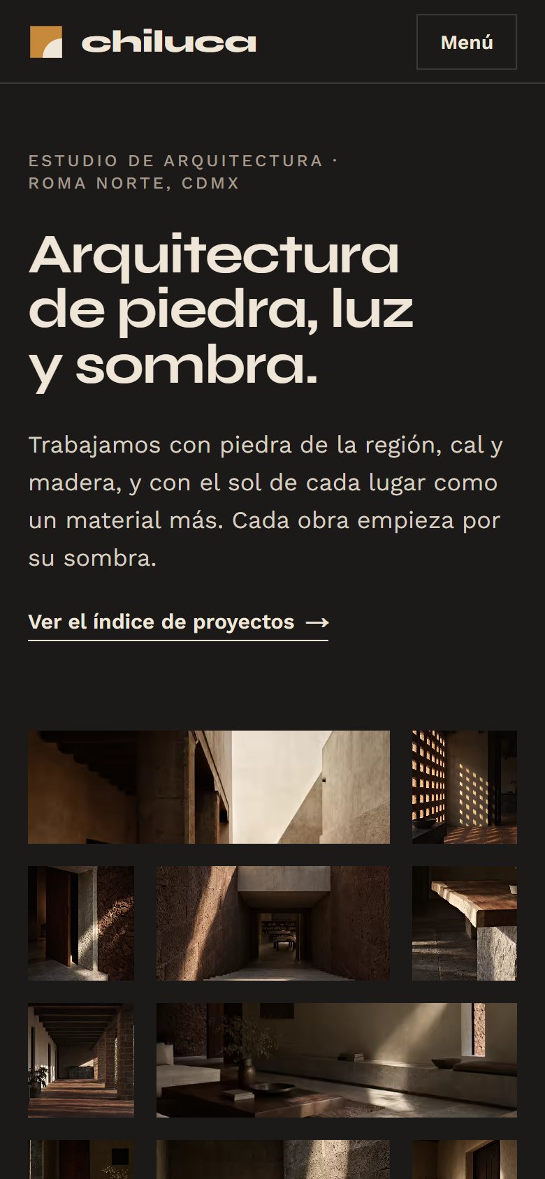
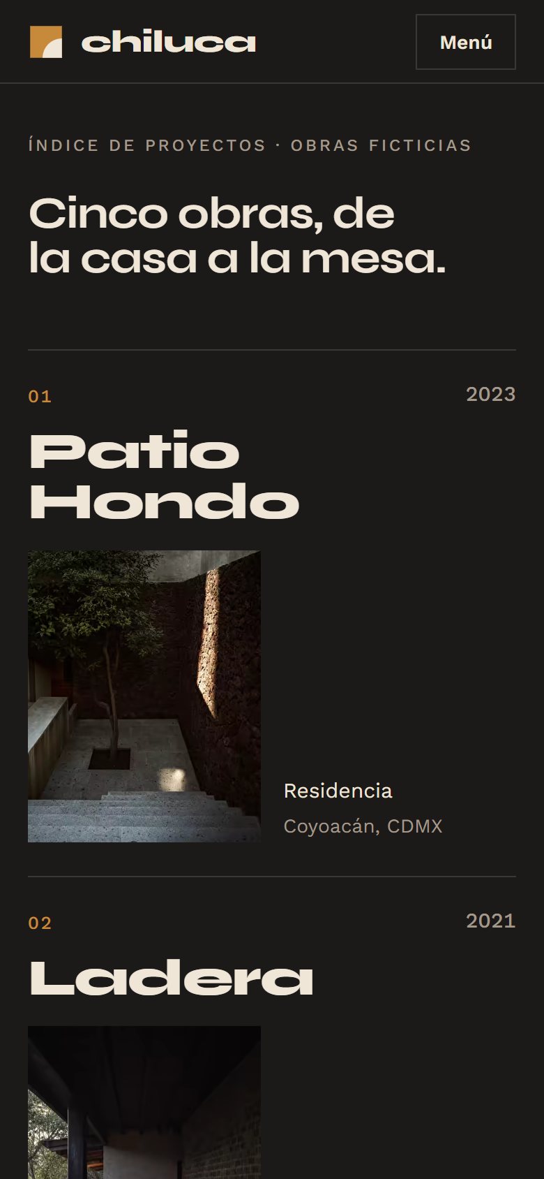
The home page opens with a wall: photos of the projects settle course by course, like ashlar masonry. Then come a typographic index of the five projects, the manifesto and an explorer of the five materials, with verified origins. All projects follow the same template: a fact sheet in the format of a museum label, a section with a sun study calculated for the latitude of the place and a construction timeline with stages and months. The contact form asks for the type of project and what stage it is at, so the first reply can already propose a visit.
01Home
- Photo wall
- Project index
- Manifesto
- Materials explorer
- The studio
02Project (five pages)
- Header with summary sheet
- Cover and text
- Shadow study
- Fact sheet and materials
- Construction timeline
- Next project
03Studio
- Opening
- Partners and the reason for the name
- What we do and how a project begins
- Contact with privacy notice
04Privacy notice
- Full notice
Visual system
Typography, color and rhythm.
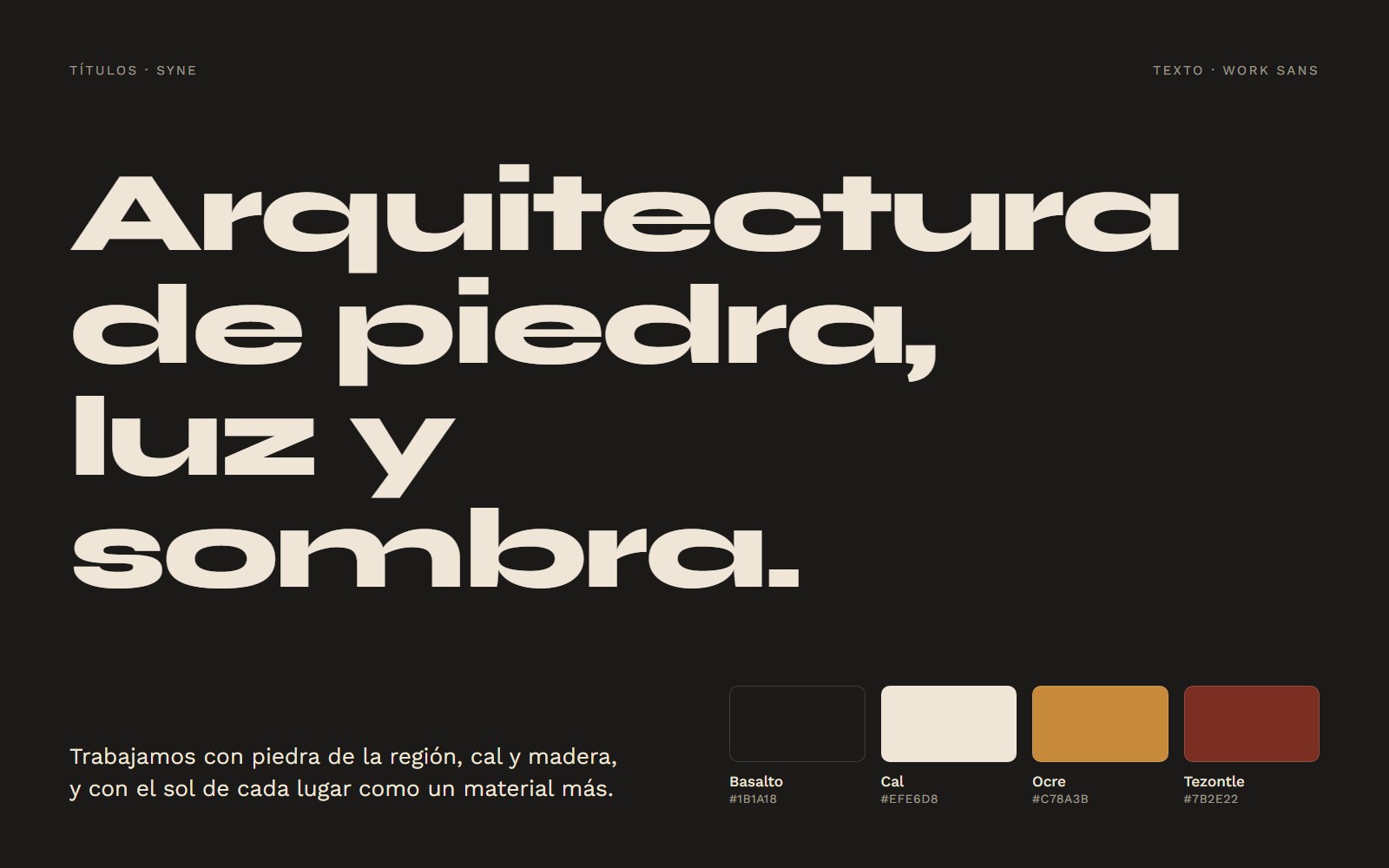
Syne, in the weight where it widens, fills the whole line of the index and gives the project names the scale of a facade; Work Sans keeps sheets and text readable. The basalt background, almost black, treats shadow as space, and limewash appears in the drawing and materials sections. Ochre stays in the details and tezontle only in shapes. Photos appear through a diagonal edge, tilted like the December sun.
- Photo wall in courses
- Index with a cover that follows the cursor
- Materials explorer
- Section with sun study
- Construction timeline
Signature moment
Wall, index and materials.
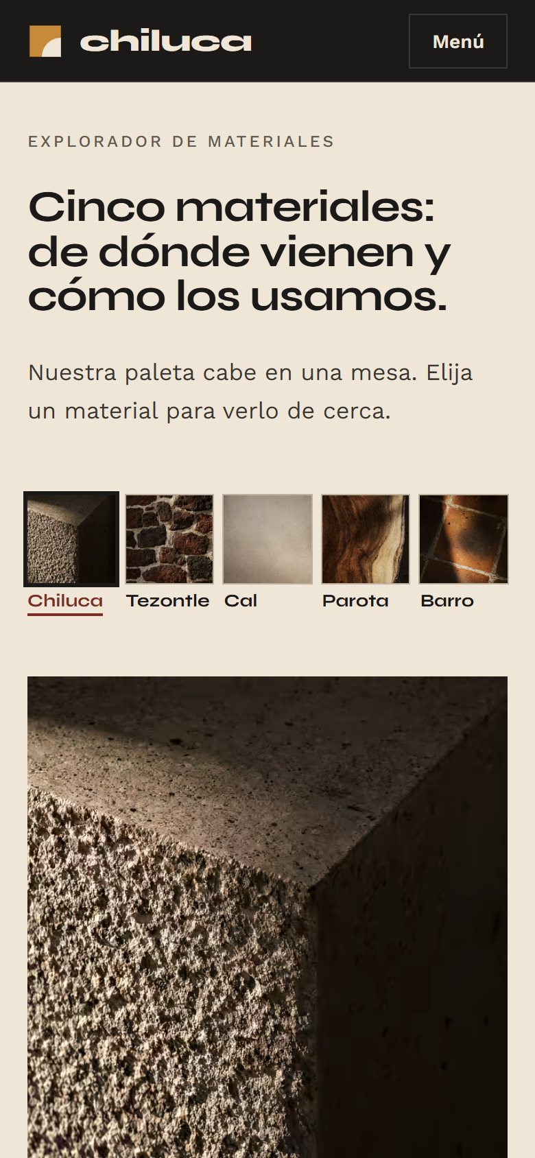
As you scroll, the photos settle like the ashlars of a wall. In the index, each project's cover follows the cursor and the other rows fade; with the keyboard, the cover appears next to the focused name. The explorer opens the five materials in close-up, with a magnifier, verified origin and the projects where each one appears. Visitors move from image to material and from material to project without leaving the home page.
On mobile
Made for the small screen.
Three screens of the site on a 390 px wide phone, the most common width today.
Receipts
Measured performance.
The scores below were measured on the published site using Google Lighthouse. They are not a promise: they record the state of the site on the measurement date. Demonstrations are presented on video. Measurements record the state of the project on the indicated date.
On mobile
- Largest visible element (LCP)
- 2.0 s
- Stability (CLS)
- 0
- Blocking (TBT)
- 0 ms
On desktop
- Largest visible element (LCP)
- 0.4 s
- Stability (CLS)
- 0
- Blocking (TBT)
- 0 ms
Measured on Oct 3, 2026 with Lighthouse 13.5.0, simulated mobile and desktop. *SEO stays below 100 on purpose: the concept site carries the noindex directive, so it does not appear on Google or compete with real businesses. Accessibility was also checked with axe (zero violations), and alignment was reviewed at 7 screen widths.
Behind the scenes
Fact sheet.
- Pages
- Home, five project pages, Studio, Privacy notice and 404 page
- Languages
- Spanish (Mexico)
- Technology
- HTML, CSS and JavaScript, no framework, generated by a custom Python script
- GSAP and ScrollTrigger for the wall, the index and the construction timeline
- Native scrolling, no smoothing library
- Sections with sun studies generated in SVG from the latitude of each place
- AVIF photos with WebP fallback
- Fonts served by the site itself, with adjusted fallback metrics
- Images
- AI-generated photographs based on material and light, without imitating work by real firms, processed as a single series; sections, sun studies and the table assembly drawing made in SVG in code.
- Accessibility
- Index and materials tabs operable by keyboard, cover visible on focus without hiding the row, reduced-motion version, calculated AA contrast and zero axe violations.
- Industry rules
- Follows the 2025 LFPDPPP (Mexico's data protection law), with a simplified notice next to the form and a full notice on its own page; professional registrations appear as examples and the projects as fictional.
Start now
Let's bring your online presence up to the level of your service.
Start with the free diagnosis: we measure your online presence and show you, point by point, what to fix first.
Booking open for new projects
Tell us about your project
A few details are enough. We'll ask about the rest.